Maximising the Impact of Your Imagery on Instagram
By Kayte Ferris
It’s obvious to say that Instagram is a visual platform, but amongst all the rumours and gossip about the algorithm, hashtags and captions, it’s very easy to lose sight of the pictures. You can have the best hashtag strategy in the world, but if your images aren’t engaging then you’re only going to have so much success on the platform. So today, ahead of Just A Card Week which kicks off on Monday, I’m going to share some tips for creating inspiring imagery for Instagram to help you really make the most of the week.
Hashtag challenges
Joining in with a hashtag challenge is an excellent way to get inspiration for your photography, and then, crucially, get it in front of an engaged, specific audience. We’re running our own challenge through Just A Card Week which will be a great place to start is you’ve never participated with a challenge before.
How it works is that you’ll be set a daily theme or topic, and then you create and share and image that is your interpretation of that topic. This is your opportunity to get creative and communicate your thoughts and ideas in an inspiring way, as well as meet new people and connect to your audience.
If you’re inspired after Just A Card Week, hashtag challenges are popping up all over the place. Large Instagrammers will often run them, as will businesses and creative organisations. Instagram also runs its own hashtag challenges, the Weekend Hashtag Project, every weekend. They announce the theme late on Friday night on their feed and it’s a great way to make new connections outside of your normal sphere.
Find your themes
If you are aspiring for a more curated, professional feed, then it is important that through all your imagery, but particularly your imagery for challenges, that you retain consistency. This is often something that people find difficult, but is quite simple once you have a formula.
Creating visual consistency is partly to do with maintaining a similar colour palette throughout and keeping the edits on your photos consistent, but it’s not the full story. There are lots of bright colourful accounts which still look consistent rather than busy, and that is down to the subject matter and composition (see @iamkristabel’s as an example).
I advise deciding up to nine different themes that you will use in your images. For my feed, I have cups, notebooks, food, blankets, outdoors/buildings, foliage/florals as my theme. If you scroll through my feed, you won’t see anything other than those subjects, replicated in different ways over and over. This creates consistency, as even if the colours change, the subjects remain a tangible thread throughout.
The must-dos of composition
I’m not one for must-dos, but these really are two golden rules to stick to. First up is only ever post images that are shot in natural light. It’s so tempting to pop up a quick photo you took in the evening with the lamp on but these images never do as well, and they really mess with the consistency of the feed. So if you’re shooting images in your shop, turn off the lights and move your subjects towards the window. If you’re trying to quickly post something in the evening, stop and wait to shoot it in the morning. You won’t get the results and benefit you want by shooting in artificial light.
The second rule is to include negative space. This doesn’t have to be in every picture without fail, but definitely in the majority. Negative space is what makes images enticing, and what makes feeds look calm rather than busy. Negative space is just blank space in an image without any subjects is. So if you’re taking a picture of flowers lying on a table, have the flowers in about a third of the frame and the rest of it just blank table. Negative space really draws in the eye and creates interest in a thumbnail-size image – inspiring people to click to see more.
Recreate successful images
So often we feel we need to be doing something different, chasing more more more, and Instagram particularly drives that feeling. But if you hit on something successful, why reinvent the wheel? Recreate images that have done well for you in the past with different props or for a new season.
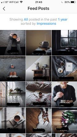
If you have a business account on Instagram, you can easily see your most popular posts. Go into your Insights, choose Content and then Feed Posts, and you’ll see your posts ordered by popularity (here’s a screenshot of mine). What are the similarities between them, and how can you create them in a different way?
Make your own image for Just A Card Week
If you’ve not yet talked about Just A Card Week because you didn’t have an image, try creating one of your own using these tips. Here is my version, and you can now hopefully see how I created it – I used my key themes and colours, shot it in natural light, have plenty of negative space around the image and chose a composition that has been popular for me before.
Although Just A Card Week doesn’t officially start until Monday, it’s not too early to start joining in! Using my tips, start planning your images for the hashtag challenge so you’re ready to post every day, and check back on Monday for the first of our social media tutorials with Emily and Sarah. Plus, our amazing giveaway is also live, so click here to go and enter!


